
A design manual is the set of rules that holds a brand together
A design manual is the document that defines how your brand may be used. It sets out the logo and its variants, the colours, the typefaces, the sizes and the spacing — and, above all, the rules for when each of them applies. It is the reason your website, your invoice, your flyer and your social profile all look like the same company, even when three different people made them.
You will meet several names for it: design manual, brand manual, logo manual, graphic manual, brand guidelines. In most cases they describe the same kind of document and differ only in scope — we break each of them down below.
Without one, a brand does not collapse overnight. It erodes: one deck in a slightly different blue, one flyer set in Arial because nobody had the licensed font, one logo stretched into a square because it would not otherwise fit. A year later nobody knows which version is the correct one — and customers see a company that does not sweat the details.
Design manual, logo manual, brand manual and design system — what is the difference?
The difference is mostly one of scope. The further up you go, the more the document covers and the more it costs — so it pays to know which one you actually need.
How the documents differ:
- Logo manual
- the narrowest document. It covers the logo alone: its variants, the clear space around it, the minimum size and the forbidden uses. Useful when the logo is finished and you simply need to hand it to a printer or a supplier.
- Design manual (graphic manual)
- the logo plus the full visual side of the brand: colour, typography, image style and applications from a business card to a website. This is the document that makes sense for most companies.
- Brand manual
- a design manual extended with the non-visual side of the brand: positioning, values, tone of voice, example wording. It covers how the brand looks.
- Design system
- the living, digital version of a design manual. It is a component library (buttons, forms, cards) in Figma and in code that designers and developers use while they work. It earns its keep on larger sites and apps where the design keeps changing.
A small company with one website is well served by a design manual. Consider a design system once you have several products, or a team working on the design continuously.
Only need rules for your logo?
If your logo is finished and you only need to hand it to a printer safely, a narrower document is enough. We wrote down what goes into it and what it looks like.
Logo manual: what it should contain
What a design manual should contain
There is no binding standard, and length runs from two pages to a hundred. There is, however, a core that no manual should be missing — without these parts the document cannot actually be used.
The mandatory core:
- Logo and its variants
- primary version, horizontal and vertical lockups, single-colour, inverted for dark backgrounds, and the mark on its own (the icon).
- Clear space
- the minimum empty area around the logo that no text or graphic may enter. It is usually derived from the height of a letter or symbol inside the logo itself.
- Minimum size
- the smallest dimension in millimetres for print and in pixels for screen, below which the logo stops being legible.
- Forbidden uses
- concrete examples of what must never happen to the logo: no stretching, no recolouring, no busy backgrounds, no rotation, no drop shadows.
- Colour
- primary and secondary colours in HEX for the web, RGB for screen, CMYK for print and Pantone for exact colour matching, each with a note on where it is used.
- Typography
- heading and body typefaces, permitted weights, a type scale from H1 down to captions, line height, and a fallback font for when the main one is unavailable.
- Image style
- which photography and illustration belong to the brand and which do not, plus any rules for icons.
- Applications
- mockups on real carriers: business card, letterhead, email signature, presentation, social post, website.
- Source files
- an inventory of what you are handed, in which formats (SVG, EPS, PNG, PDF), and which one to use where.
The logo section: clear space, minimum size and forbidden uses
The logo section is the page most people open in practice, from the printer to the colleague making a presentation. It holds the clear space measured with a part of the logo, the minimum size in millimetres and pixels, and pictures of forbidden uses crossed out in red.
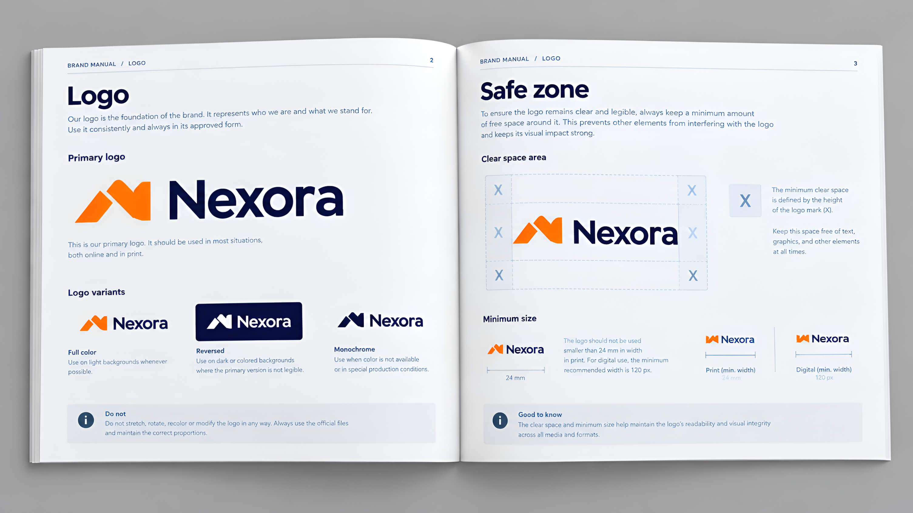
How to write down the rules for your logo
We cover clear space, minimum size, colour versions and misuse, with pictures, in a separate article on logo manuals.
Logo manual: what it should contain
Colour and typography: the part that decides whether the website looks good
Record every brand colour in every format you will need. HEX for the web, RGB for screen, CMYK for print, and Pantone wherever the exact shade matters — on textile printing, for instance. Without CMYK and Pantone the printer will guess, and the result will not match your website.
Give every colour a role as well: which one is primary, which is secondary, which is for buttons and which is only ever a background. A palette with no usage rules is just a swatch sheet.
For typography, the name of the typeface is not enough. Add a type scale — actual sizes and line heights for H1, H2, H3 and body — and the weights that may be used. And always name a fallback: a licensed font will not be available to everyone who prepares something for you.
Check the contrast of text against its background, too. A combination that looks fine on a designer's monitor can be unreadable on a phone in sunlight and may fail WCAG accessibility rules. The contrast ratio belongs in the manual, not in one person's head.
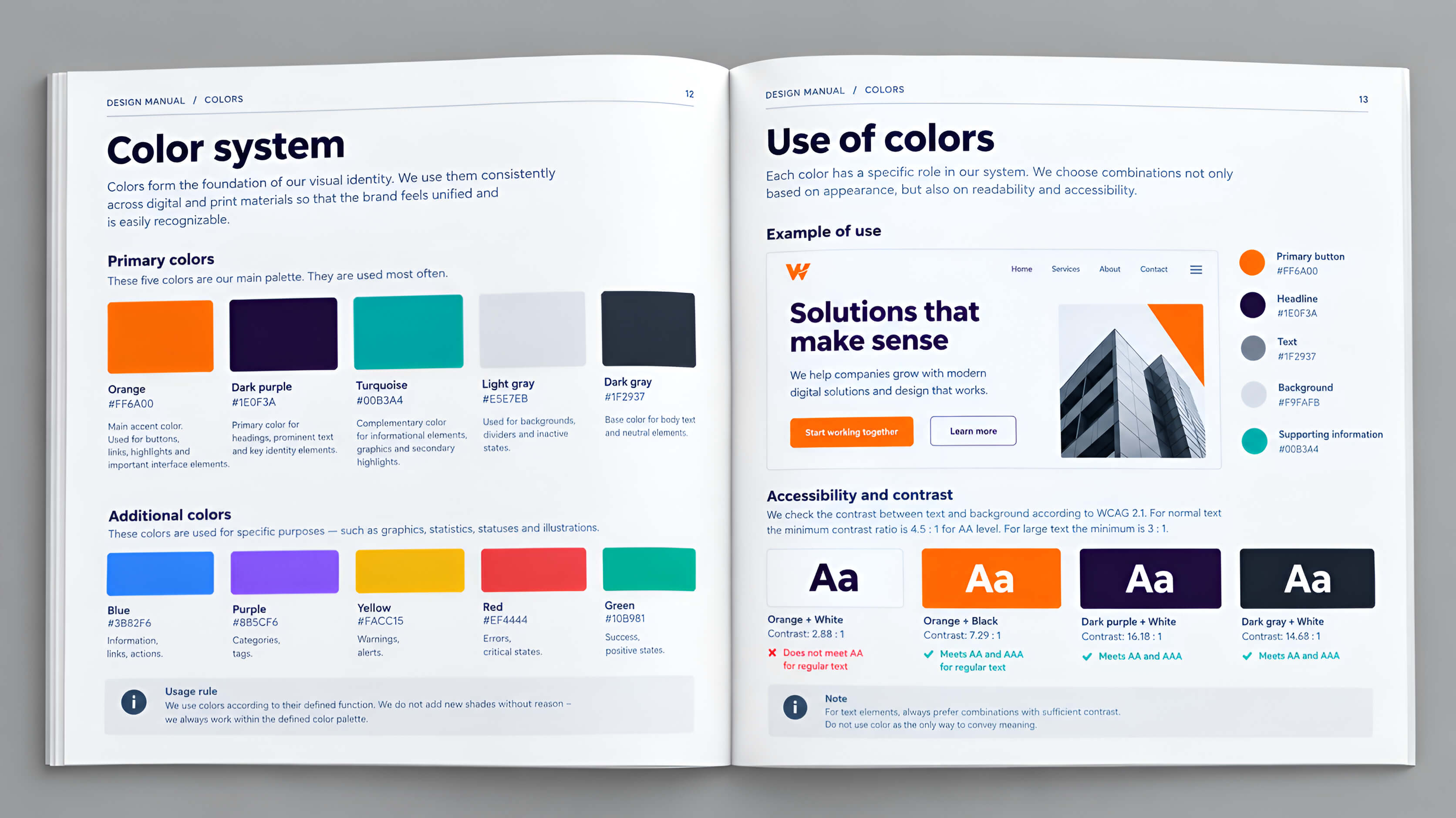
A design manual template in PDF — build one for free
If you are looking for a design manual template, the fastest route is generating your own foundation. That is exactly what our free web design tool does.
You pick your field and the tool proposes a pair of typefaces and two colours that work together. You see them on a real sample page, and you can keep changing the colours until you are happy. Every colour comes with a WCAG contrast check.
We send the result to you as a design manual in PDF: the typefaces, a type scale from H1 to body text, both colours with their contrast ratios, and rules for where each is used. Free and without registration — effectively a basic design system for your website that a designer can start from immediately.
Build a basic design system for free
Typefaces, colours and a type scale for your website. No registration — we email the PDF.
Open the web design tool
How much does a design manual cost?
Price follows scope. A logo on its own is the cheapest item, because it covers a single element. A design manual costs more, because on top of the logo it defines colour, typography, image style and application mockups — a document you genuinely use.
With us, a logo design comes to €120 and a complete design manual to €350. If you also need printed materials and merchandise, we add those as a separate item from €50.
One question settles most of the decision: how many people will work with your brand? If it is just you and your website, a logo plus the free foundation from our tool is enough. If you have colleagues, suppliers, a printer and an agency, the manual pays for itself the first time it prevents a round of rework.
Need a design manual built for you?
We prepare the logo, the colour, the typography and the application mockups — in one document you can hand to anyone.
Branding and design manual
When you really need a design manual — and when you do not yet
A design manual is not compulsory for everyone. It starts to matter the moment more than one person touches the brand, or the brand appears in more than one place.
You need a design manual if…
- you brief external suppliers
- your decks are made by someone other than whoever built the website
- you print in several places
- you are planning franchises or branches
- you are rebranding and want the change to land everywhere at once
You do not need one yet if…
- you are a one-person company with a single website
- you make everything yourself
- the brand does not appear anywhere beyond that website
In that second case, start with the foundation — a logo, two typefaces, two colours and a handful of rules — and write the manual when the first other person starts working with your brand.